
I am a detail oriented person. I recently read a colleague’s dissertation and before I could get to the details in the writing, all I could see where inconsistencies in the use of spaces and punctuation. For sure, it was a draft and some people work that way—getting their ideas down first and worrying about the details later. Some people, I imagine, can’t see the details; they instead think in big ideas. I have a friend, for instance, who, to be sure, is a really smart person. But they struggle with spelling words. They take great pains to edit their writing before they send off articles, but in emails to me, they don’t bother. And I’m almost paralyzed trying to read them!
While it sounds like I value a neat and tidy page when it comes to spelling, grammar, and punctuation usage, let it be known that I surround my work space in clutter. It is true, I see the appeal of a clean desk. But I feel more comfortable having tools at the ready. My soda, a few pens, a few stupid things to play with, like rubber bands; I have my notebook, a number of pens and pencils, a remote control, a stack of CD-ROMs. I will use the weekend to clean these all up but by the end of another week, they’re strewn about again. Doesn’t bother me one bit, either!
While people can write, one perfect word at a time, both writing without regard to spelling or punctuation and writing in one completely beautiful sentence after another are equally valid ways to write. While working in a minimalist environment is conducive to some, others might prefer the distractions of things around them, headphones blaring, and a super comfortable chair. To each their own; people have their own ways of being productive.
But one of the things that I’ve noticed about presentations over the years—not the actual act of someone sharing information, but the slide deck they’ve created—is that what you can produce for the screen and what you can produce for post-presentation distribution shouldn’t be equal. If you’ve taken any advice from Garr Reynolds (author of the Presentation Zen books), perhaps you’ll get at where I’m headed: great slides support the speaker. They do so with emotionally-charged photos, a few words, when necessary, and clean visual diagrams that help people see complex systems that you discuss. Graphs are okay, and so are video clips. But a good deck, minus the speaker, shouldn’t be a good deck anymore. And yet the default that I’ve seen for over twenty years in the education field, specifically (but certainly this trend isn’t unique to education), is one of slides that are meant to provide enough information (read: words) to be useful without you. And even sometimes when this works, they’re rarely engaging to look at, and moreover, there were compromises made to fit that content into a slide to begin with.
If you’ve ever been trained on delivering a presentation and directed not to read the words on your slide then you know where I’m coming from. At that point they didn’t need you. And you likely have a better way of spending your time other than reading to adults.
Reading to kids is still cool, though.
Case in Point
I recently (like last weekend) put together a presentation for an upcoming training I plan to do. I’ve gotten into the Zoom rhythm of spending my time showing things, talking them through, pausing, and checking for understanding—all of this after I spend time getting to know the folks who have joined me on the video call. In some cases, I’m teaching how to use a computer software program and so I’ll actually be doing things live.
In other situations, I use slides. But these aren’t the slides I created for the live session.
They’re for what I hand out after the session.
This week’s training is on Google Gmail. I told this to a friend, that I was offering a Gmail session, and he asked me, in jest, “your colleagues don’t know how to use Gmail?” I clarified. “I am going to teach folks how to do cool things with Gmail, like use it to drive up their productivity.”
“Oh. I just use it to send email.”
Exactly.
Now, one could argue that the best way to show how to use software is to use software. I could create a video guide. I tend to love watching videos about people using software. I can control the pace by moving the playhead around and I can actually see someone doing what I want to learn how to do. But I’ve also met people who cannot stand learning from videos. To each their own.
So I do write, but I augment my writing with hyperlinks. If someone else made the video, then I don’t have to. And I see that benefit being, maybe they can make better instructional videos that me, or else they can explain things in a different way than me. If the way I explained it was difficult for others to understand, maybe they’ll have better luck with someone else.
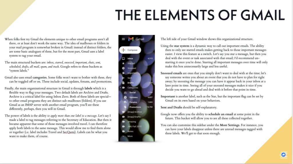
So in the example above, it comes from what I call my Slidedoc. This is a trademark from Nancy Duarte, who has written a few books herself. You’ll usually find them next to Garr Reynolds if you still buy books in a store; they both have a lot to contribute on making good slides and delivering great presentations. She uses slideware (for me, my favorite is Apple Keynote) to write a medium-form, graphic rich document. For contrast, here’s the same “page” or slide from the presentation I plan to use:
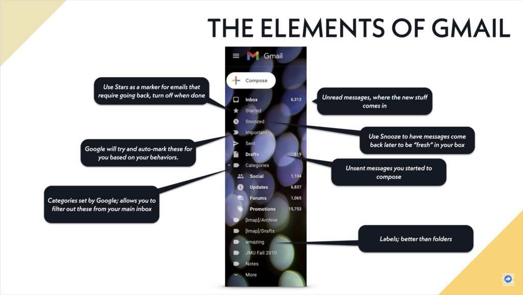
In the slide version, I can use builds or animation to bring each label up as I discuss the features. This way I’m not distracting my audience with too much to read while they listen to me.
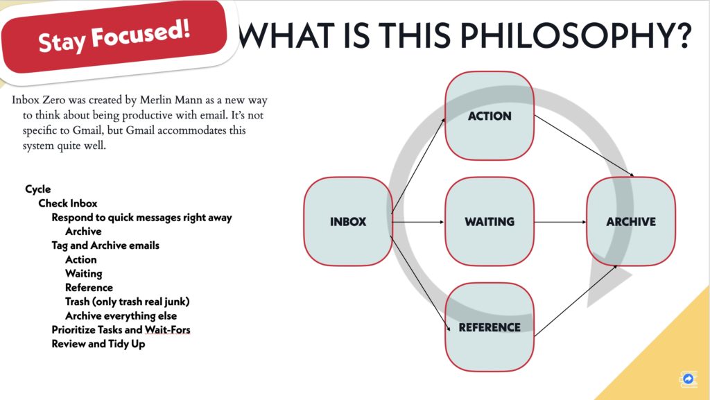
Here’s another example from the same set of slides. Note that the boxes, inbox, action, etc., are animated and come up after I explain the cycle steps:
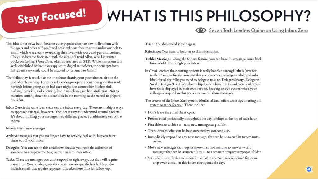
And here is the same “slide” as a page in my document:
Linear vs. Non-Linear
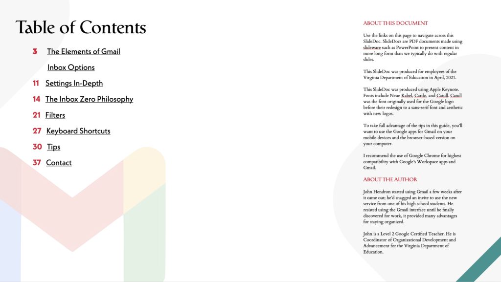
You may have noticed from my screen pictures that I include a graphical link in the bottom-right corner of my slides. These will take you back to the second page, the Table of Contents in my PDF document. While folks have no real choice about where we go and how in a live session, they may only want to review, say, Inbox Zero after the training. By creating hyperlinks in your PDF/slideware, you can help produce a helpful document that’s not dependent upon a linear read.
Reusing Content
So my method, again, is to create the Slidedoc first. This is the rich, fully explained version of my content. I use visuals, but the document is for readers. I don’t include animations or embedded videos because it will become a PDF. I do, however, build in hyperlinks to external resources.
I find building this document helps build my expertise on the topic. And I can include more in this handout that I will have time for in the session, and that’s okay.
Then, when it’s time to create the actual slides, I make a copy of the original Slidedoc and then strip out the wordiness. I take out what’s not necessary, I emphasize visuals by increasing the size. I might play a video clip or two; I could even breakout of my slides and do a live demo. But the only time they’ll see those slides is during the call or the live presentation.
The Slidedoc is what they get for dessert.
Why do you make two presentations, then?
Because I know watching people talk about bullets on a screen is far from engaging. I know I’m more valuable making people laugh, smile, think, consider new ideas, than preparing something to read. But I also know if I do a good job at presenting, I am more likely to get follow through after the session. For my example, maybe some folks will try Inbox Zero with Gmail! And when they need support, they don’t need a slide showing off a picture of my inbox.
They may need a reminder about why we’re even doing this.
Or how to setup their Gmail settings. Or what those fancy keyboard shortcuts I was talking about were, because you know, people forget things.
This isn’t about me, it’s about my audience. Slideware isn’t some magical invention that came down from God through Bill Gates. It’s software that allows me to position graphics and tables and charts and text boxes into a rectangular screen. If we care about our audience, we can do better than giving them a vapid set of slides, however well-engineered we made them to capture their attention, hearts, and minds during my forty-five minutes with them.
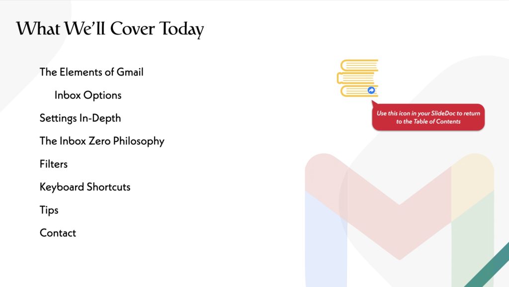
Here’s one more example. I think it’s good practice, generally, to give folks a scaffold at the start of a training about what you will cover in the session. This is also an opportunity to ask if there are things I missed that I can possibly address during our time together.
Conclusion
I’ll name drop once more. Edward Tufte once wrote condemning the use of PowerPoint in organizations to convey rich information. His example included the story of how engineers at NASA used PowerPoint to produce documents ahead of the Columbia flight that ended in disaster. His point was that the information density of a PowerPoint slide was too low to convey enough rich detail; engineers had cut out important details that would have been critical to know before re-entry.
It should be clear that slideware such as PowerPoint or Keynote can be used to create documents. Duarte distinguishes between three densities: slides, Slidedocs, and documents. The point I am making here is that sometimes the best handout after your training or talk is a long form document or video. Or maybe it’s a Slidedoc. But providing slides—with low information density (read: using fonts big enough to be seen in the back of a room)—is never great.
So, I don’t care if you start your training with a joke; an icebreaker, or something else. That’s up to you. I don’t care if your participants are actively moving around the room, or else sitting back in a chair in a hotel ballroom. That’s up to them (and you). But if you want to provide them something helpful that can stand up on its own, which is sometimes what happens with PowerPoint decks (hey, got this great presentation at the conference, I’ll send you a copy!), consider how useful that print-to-PDF version is. We can do better than sharing our slides, we can make Slidedocs.
Try a Slidedoc. You already know how to use the software.
Postscript
Did I get you interested in the Gmail stuff? Check out Jeff Su’s video on Inbox Zero. I prepared for my training by watching overdosing on videos like Jeff’s. I found his videos to be well-produced, easy to follow, and he’s good about repeating things if you missed it the first time.